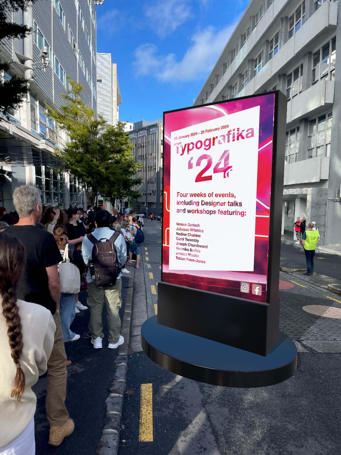
I love typography.
Semester 1 of year two kicked off with a project revolving around a typographic brochure. We were given a document of information that needed to be included, it was up to use to divvy out the information in a legible, interesting way. The project was to be printed and folded (as to why the interesting orientation of pages).
We were told to push the boundaries while at AUT, experiment with different types of design that is out of our comfort zone in a safe space; therefore, I decided I wanted to work with images rather than illustration. I went out with a camera in Auckland City and photographed everything I thought could make an interesting colour palette or theme. Adjacent to the BurgerFuel on Queen Street is a storefront with neon light arrows, I ended up basing my project on neon lights due to the interesting effect the image was producing.


